An Augmented Reality Training Solution for the University of Winchester
Problem Statement
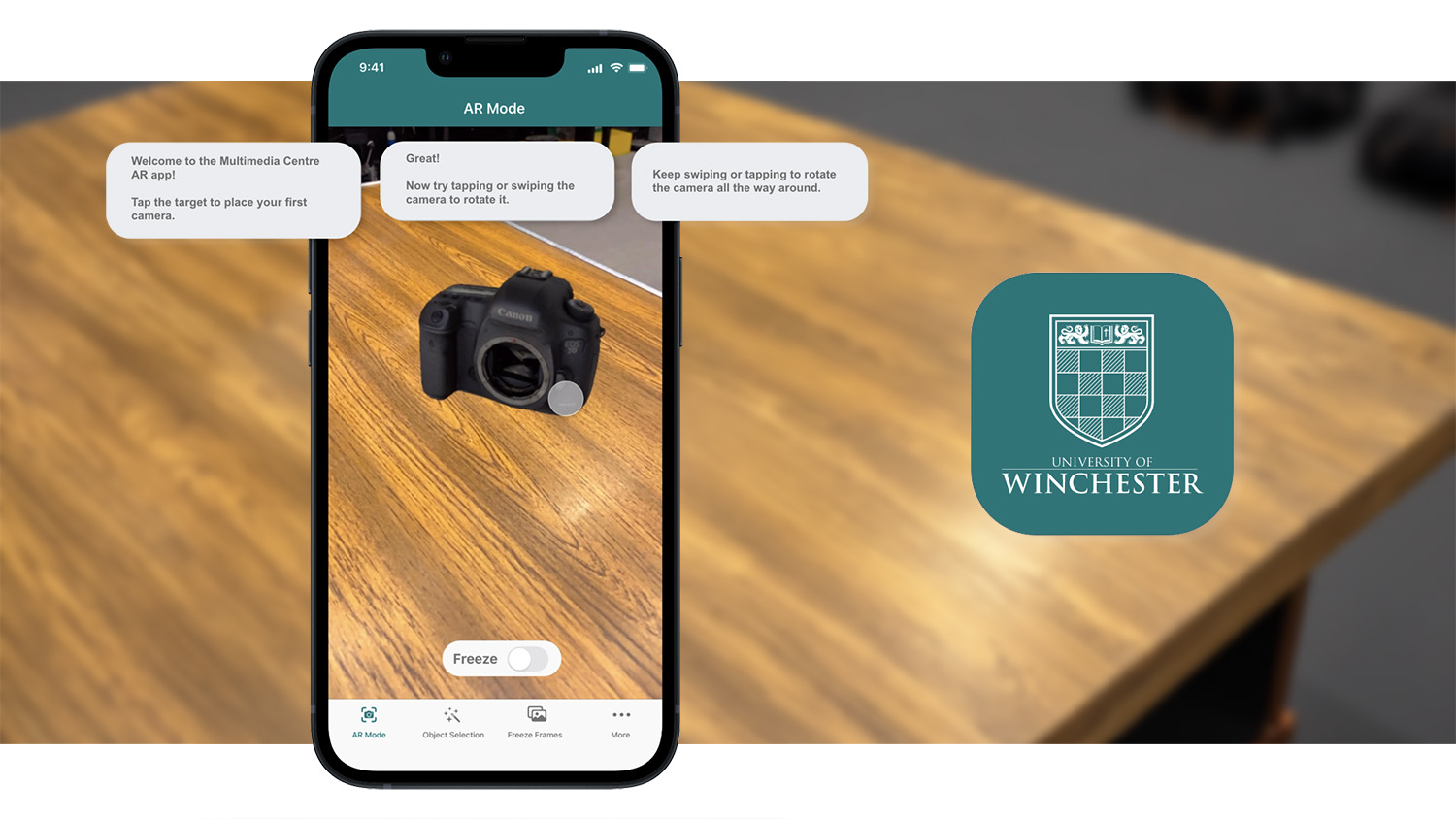
The University of Winchester's Multimedia Centre provides training and short-term loan access to cameras, lighting, and sound equipment. However...
...a reliance on in-person training for camera equipment has resulted in long wait times due to high staff workloads.
Proposed Solutions
Prototype an augmented-reality mobile application which can:
Research Method 1: Qualitative Data Analysis
A spike in training demands, especially with new students, could overwhelm staff.
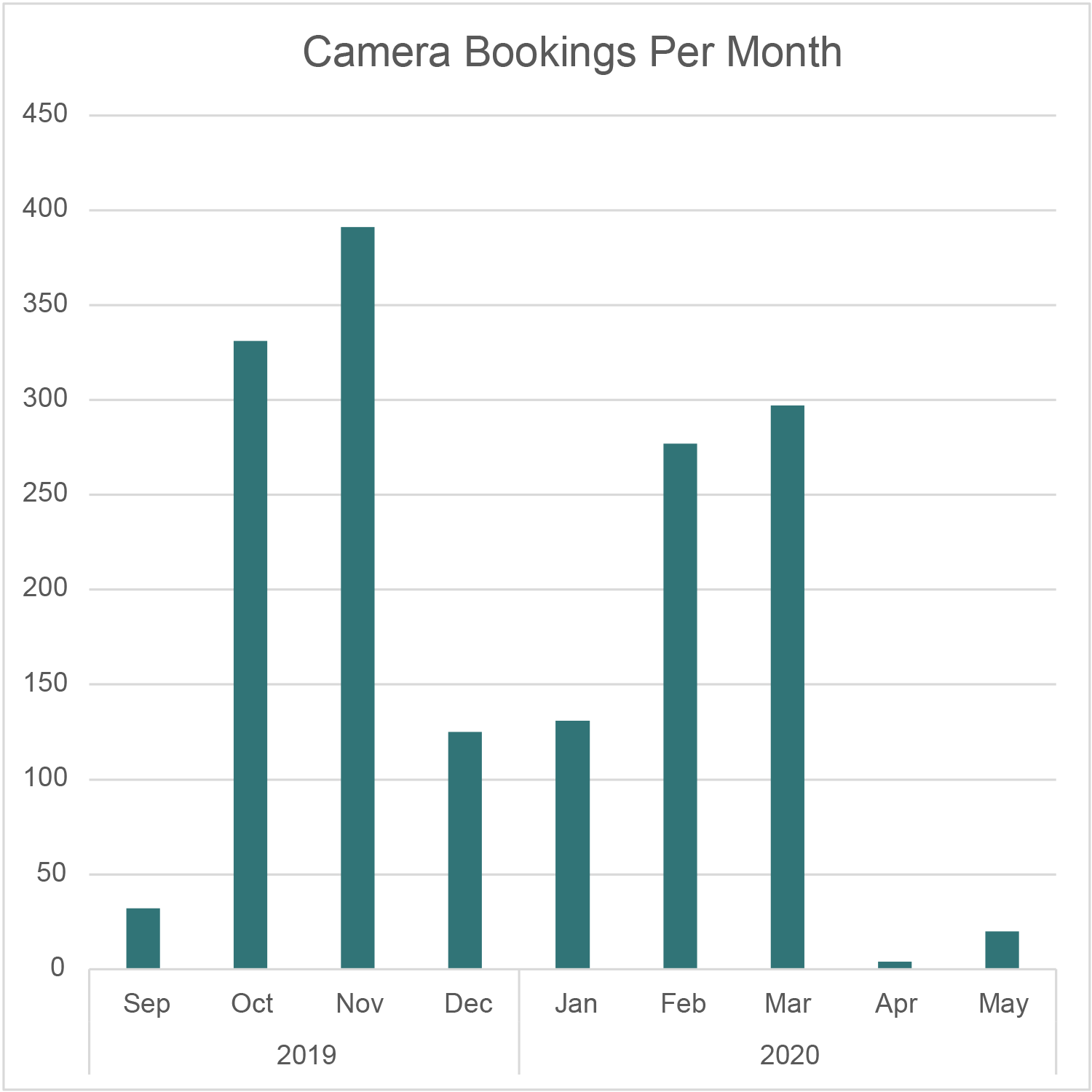
The University did not collect data on camera training bookings but did provide camera loan data. The number of training bookings could not be expected to correlate loan data, but could still inform assumptions:
This data implies that the solution could help by attenuating the demand for staff training during ’spike’ periods.
Research Method 2: Focus Groups and Journey Mapping
Focus groups highlighted several potential benefits of using a simulation for training.
A series of focus groups were held with technicians and training staff, identifying pain points across the in-person training process, from initial booking to post-training support. Pain points were placed together to produce an affinity diagram and identify improvement opportunities.
Key opportunities identified:
| Pre-Training Administration | Preparing for Training | The Training Session | Assessment within Training | Post-Training Administration | After-Support |
|---|---|---|---|---|---|
| Lack of online learning resources | Training preparation is time consuming | Students sometimes passive in sessions | Paper forms present a GDPR concern | Time consuming | No revision or refresher materials available |
| 1:1 training is inefficient with large cohorts | Preparation can be wasted due to non-attendance | 1:1 training sessions - difficult to demonstrate some equipment | Paper forms / standardisation not always appropriate for checking learning | Extant filing system for attendance and assessment results is not efficient for checking | |
| Admin for training requests is time consuming | Slow student responses to availability enquiries - equipment becomes unavailable | Students are not always happy to attend in-person | Students can feel pressurised to sign forms to agree training has taken place, despite not feeling the have demonstrated this enough | ||
| Timetabled training sessions clash with student lecture timetables | Training sessions are taking valuable resources away from students who need them for projects | Assessment via questions and answers can feel awkward for students | |||
| Technicians are usually booked 2 weeks in advance |
Research Method 3: Qualitative Data Analysis
Four student personas comprised focus group data, identifying varying engagement, confidence, knowledge, and attitude levels.
Data collected from focus groups with staff and students resulted in four personas most engaged with the training provision. These personas varied in confidence levels, pre-existing camera knowledge, and attitude towards training sessions.
Several persona-informed situations were devised to pre-test technology acceptance. Each of these situations would be considered during the ideation and testing processes:
| Student Persona | Image | Student Persona | Image | |
|---|---|---|---|---|
| Jack, the ‘Eager Beaver’:
Jack is proactive and meticulous about camera gear, investing heavily in training and expecting the university to match his dedication. |
 |
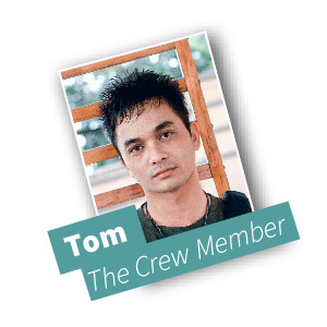
Tom, the ‘Crew Member’:
Tom is practical and collaborative, focusing on team needs and seeking clarity through questions and online research, but skips extra training. |
 |
|
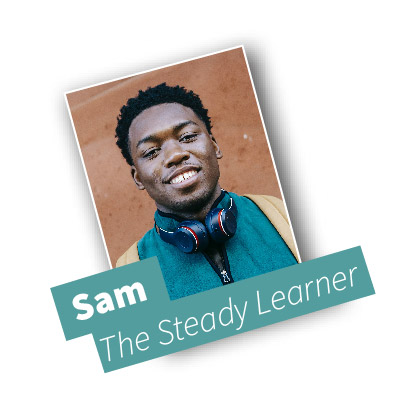
| Sam, the ‘Steady Learner’:
Sam enjoys learning but finds equipment challenging, relies on friends for training support, and hesitates to seek staff assistance, affecting project progress. |
 |
Marina, an International Student:
Marina is assertive and driven, preferring individual training for hands-on equipment guidance to overcome language hurdles and fully utilise university resources (due to paying higher tuition fees) |
 |
Research Method 4: Content Audit
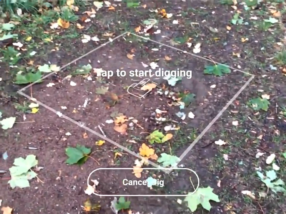
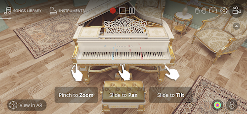
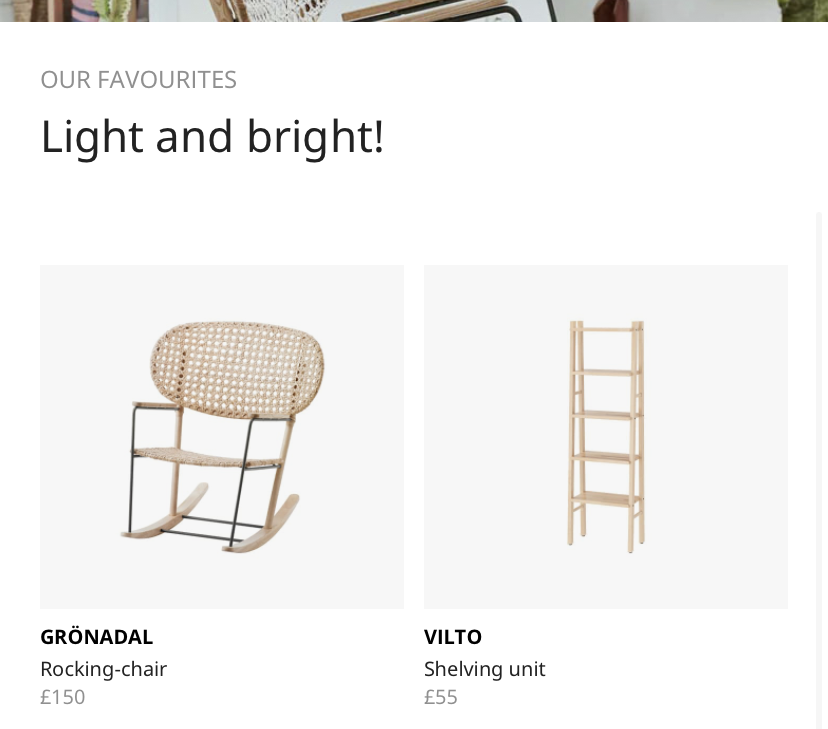
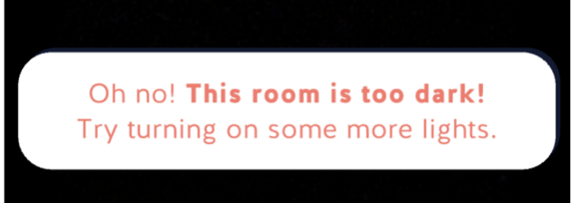
An audit of similar AR applications revealed several design patterns which enhanced their usability and accessibility.

Research Method 5: Academic Journals
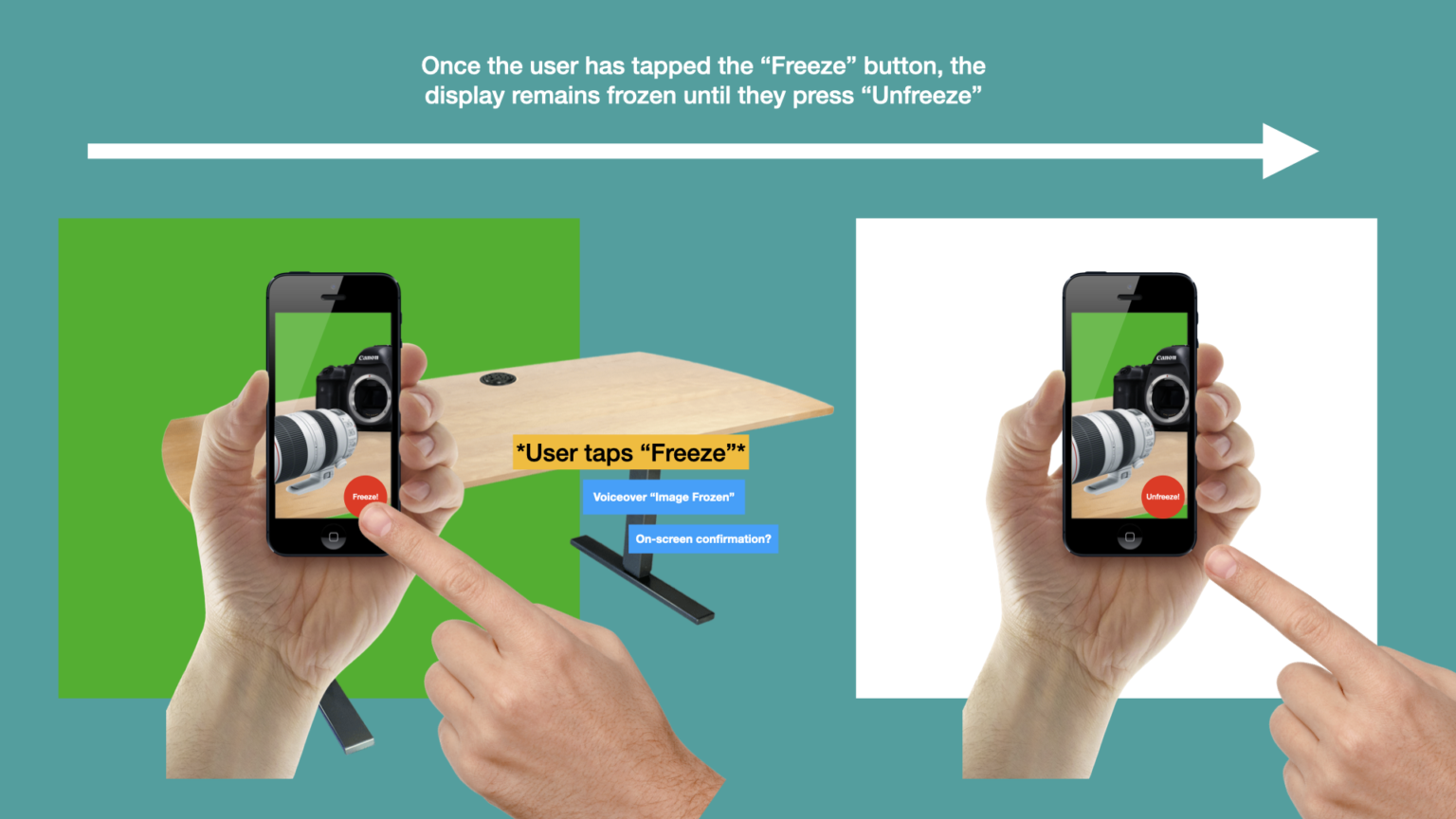
A 'Freeze Frame' function could increase accessibility for students experiencing motor or cognitive impairments.
A small thematic analysis focused on accessibility functions within AR applications was completed. One notable function was ‘Freeze-frame’, which would permit the user to pause the AR experience so that they could inspect their device’s display from a comfortable position before resuming (Herskovitz et al., 2020). Students experiencing unstable walking, involuntary movements, or cognitive impairments may benefit from this function.
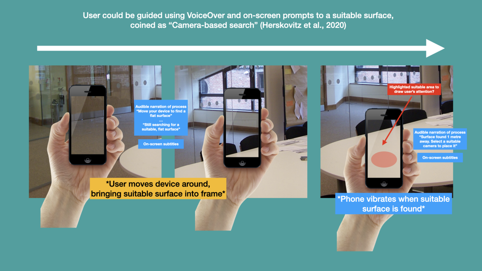
“Aiming cameras non-visually is, in general, known to be a hard problem, and we found that the difficulty is only magnified when the position must be held stable while also interacting with the mobile device” (Herskovitz et al., 2020)
Application Task Flows
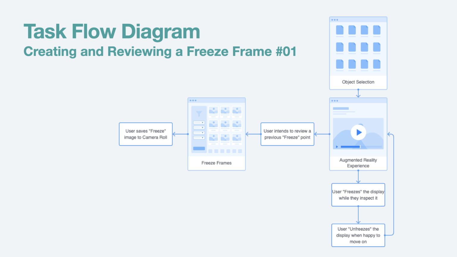
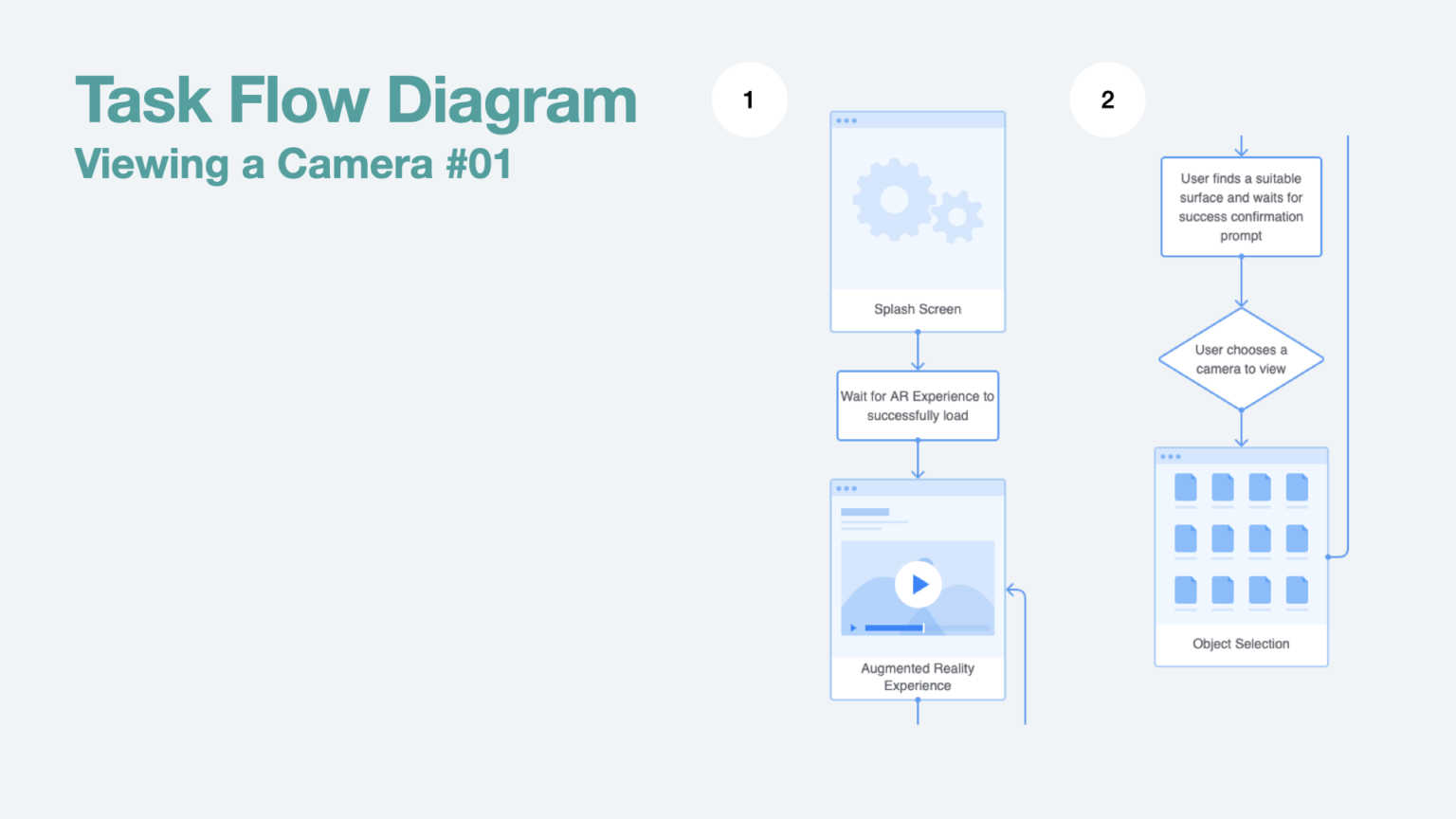
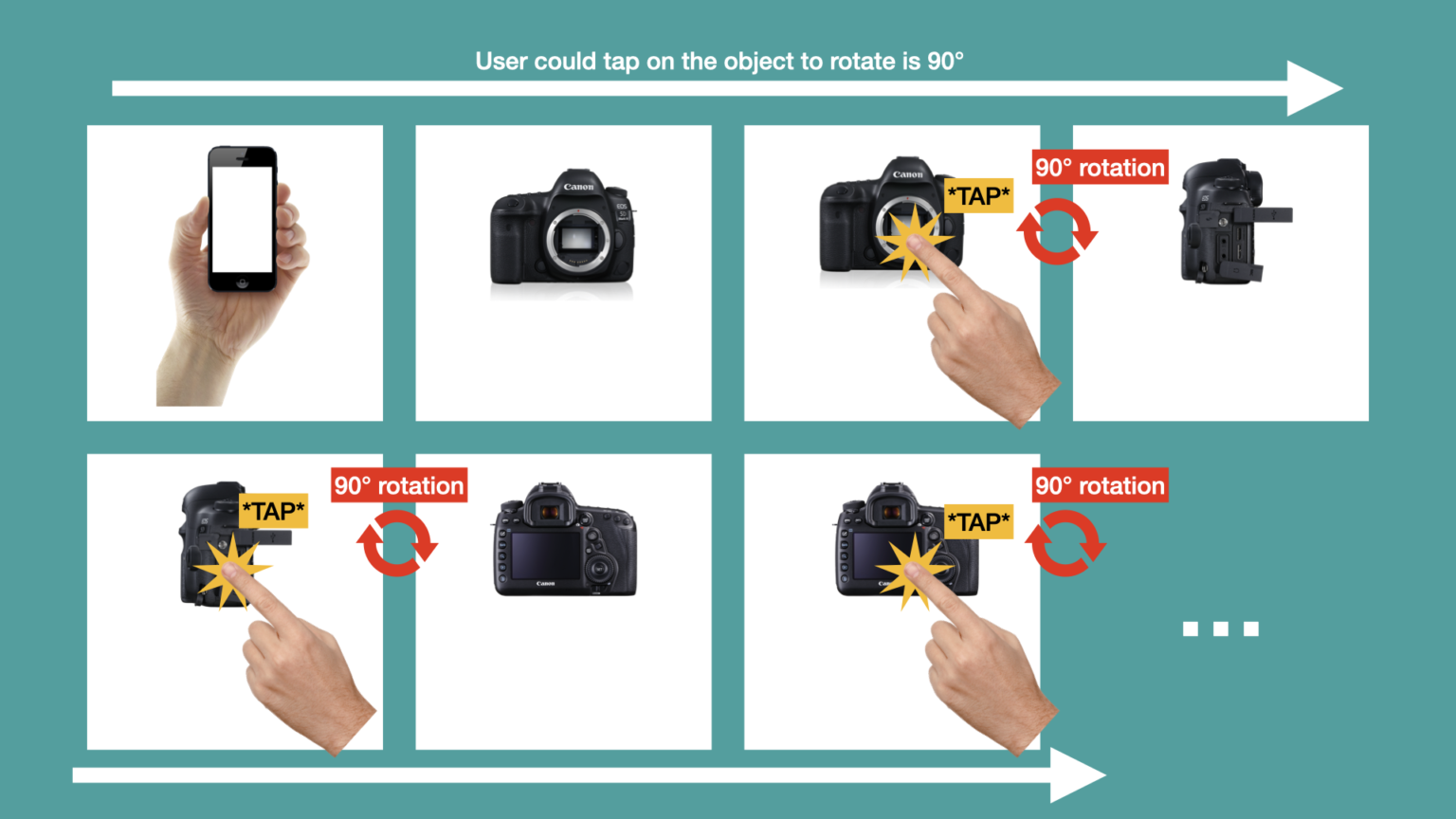
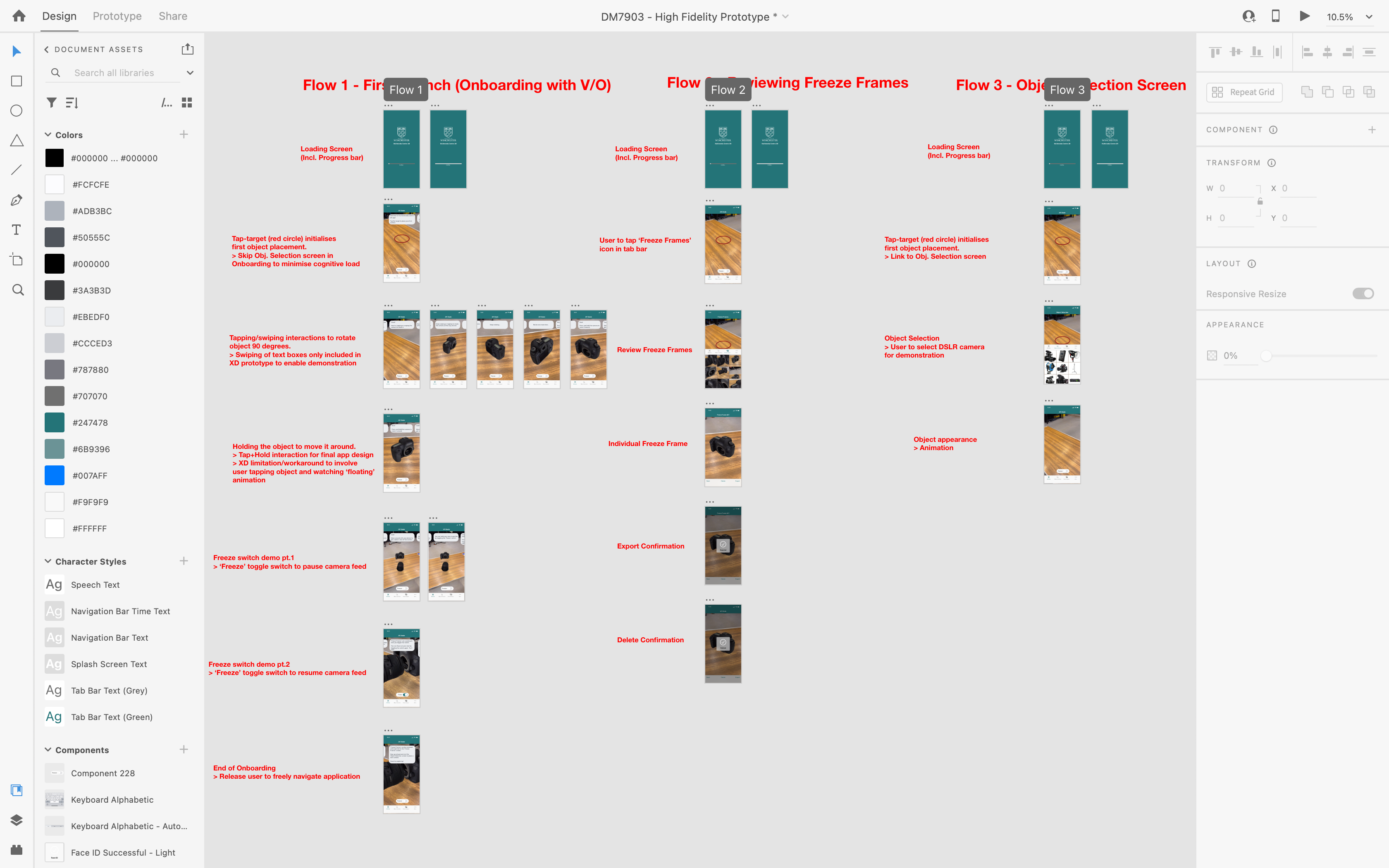
Two mandatory task flows were identified that would become the basis for the design and testing process.
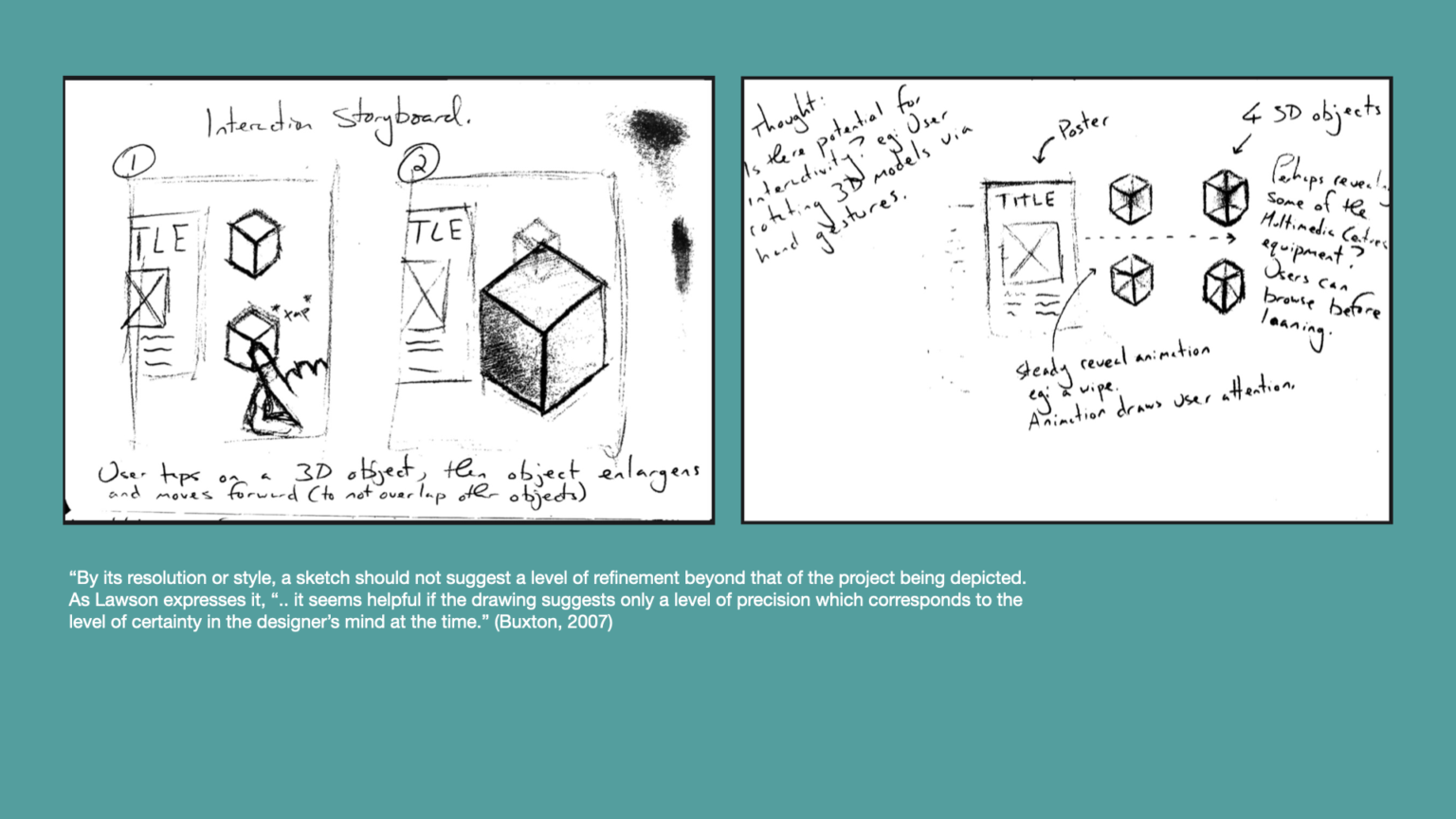
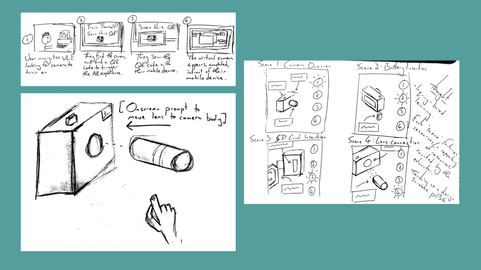
Ideation, Storyboarding and Sketching
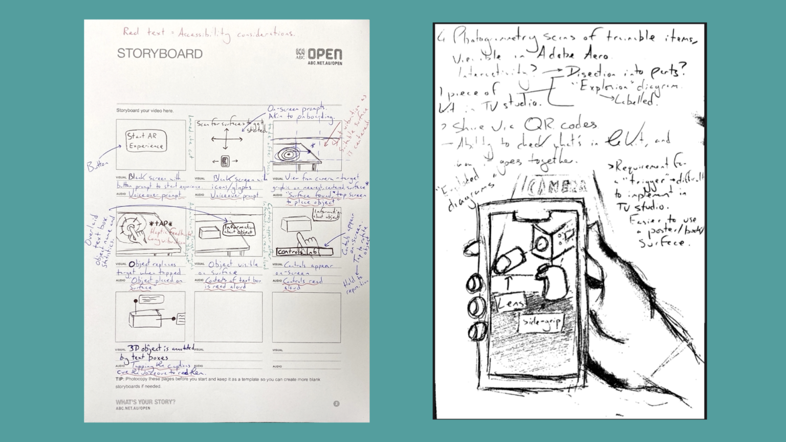
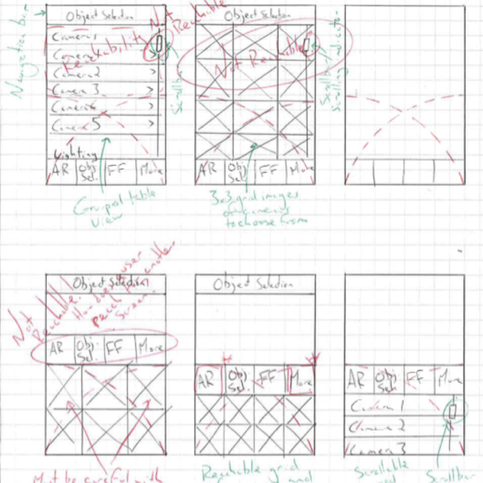
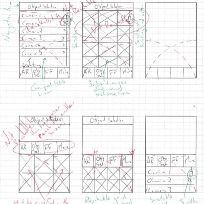
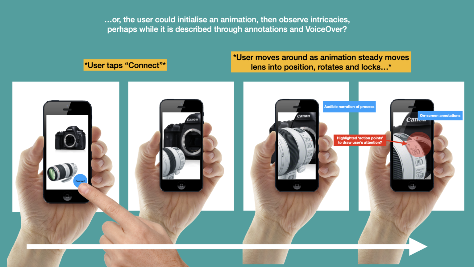
A range of progressively detailed sketches were developed in parallel with regular consultation with training staff and students.
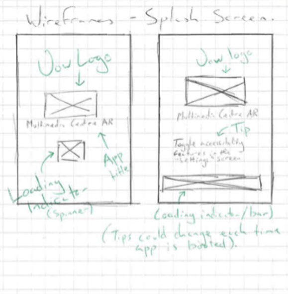
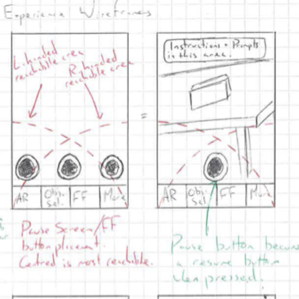
Wireframing and Interaction Designing
A range of progressively detailed sketches were developed in parallel with regular consultation with training staff and students.

Paper Prototyping and Usability Testing
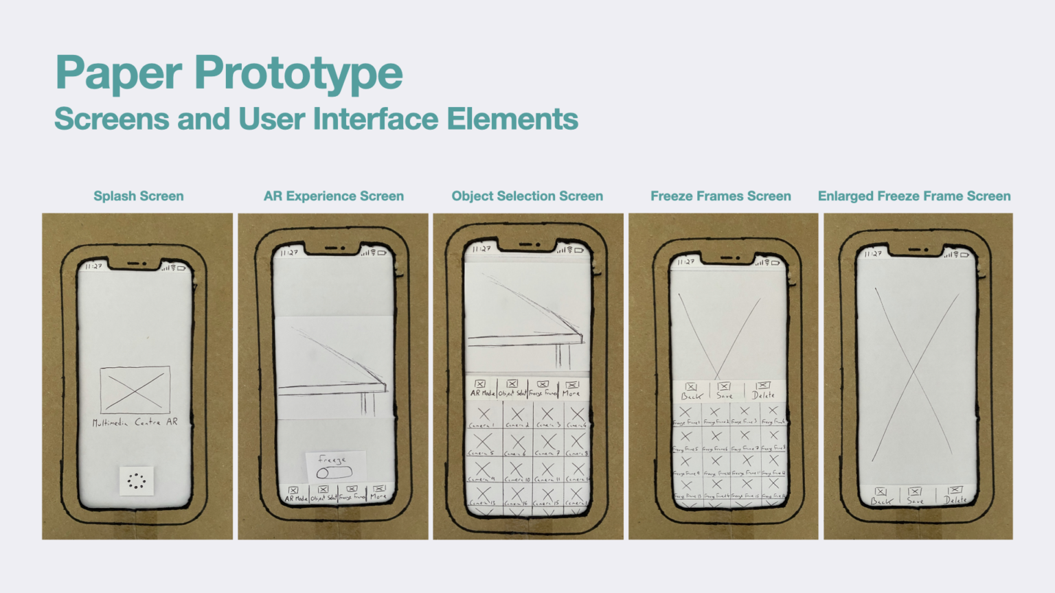
Test participants can easily navigate using the tab bar, object drawers, and toggle switches.
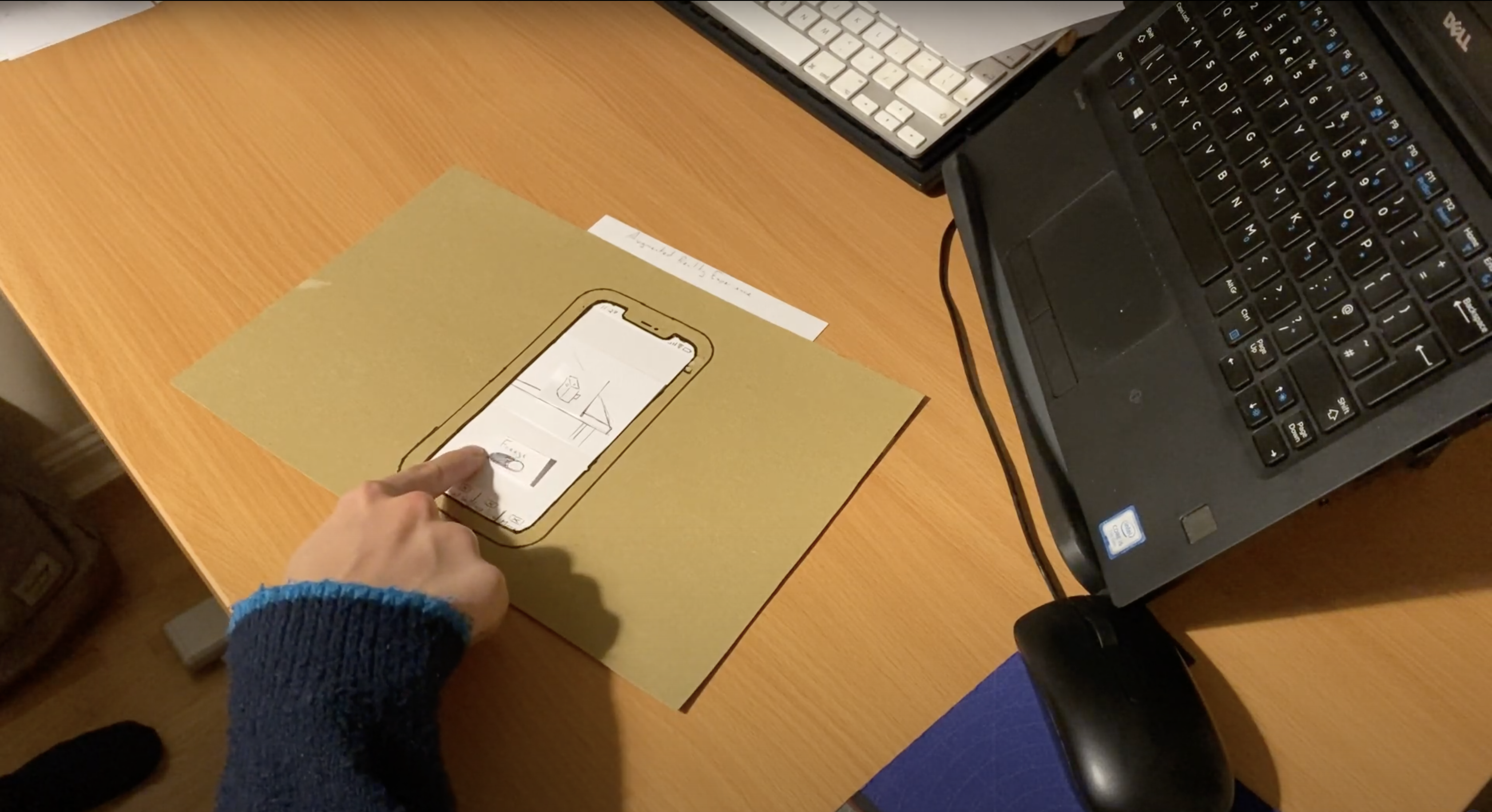
A paper prototype was created, and an initial round of ‘think-aloud protocol’ usability testing covered both task flows:
Test participants were provided with the following scenario:
”You are a student at the University of Winchester and requested camera training. You have downloaded an augmented reality mobile application on your phone, which the University recommended you attain the required training.
In this usability test, you launch the application for the first time and explore its features. Please complete the introduction, view two cameras, and save your first ‘Freeze Frame’”.
Usability Testing Outcomes:
Prototype Development and Usability Testing
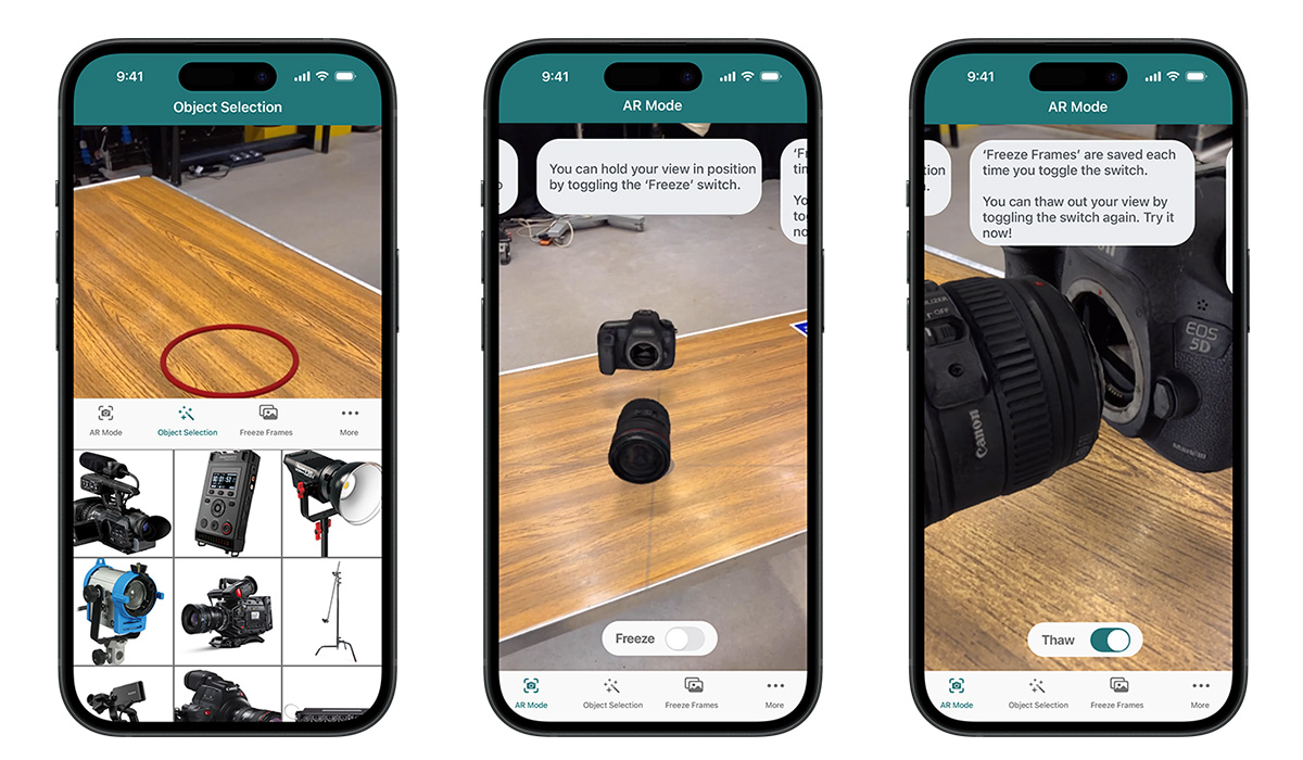
Once wayfinding mechanics had been designed, tested and remediated, a further prototype was created, which would be used to test user responses to animation and graphics. The University's branding guidelines were adhered to when creating the user interface, and testing was completed using an Adobe XD prototype on an iPhone.
Further usability tests focused on the tester’s experience of basic app functionality and accessibility functions.
Each test revealed where the tester would become confused or behave unintendedly. These issues must be rectified to prevent them from being distributed as a final-release candidate for the mobile application.
Final Design Highlights and Lessons Learned
Functionality Highlights
Usability and Accessibility Highlights
References
Herskovitz, J., Wu, J., White, S., Pavel, A., Reyes, G., Guo, A. and Bigham, J. (2020). Making Mobile Augmented Reality Applications Accessible. ASSETS ’20: International ACM SIGACCESS Conference on Computers and Accessibility. [online] Available at: https://dl.acm.org/doi/10.1145/3373625.3417006 [Accessed 26 Sep. 2021].
WebAIM (2012). WebAIM: Motor Disabilities – Types of Motor Disabilities. [online] Webaim.org. Available at: https://webaim.org/articles/motor/motordisabilities [Accessed 28 Oct. 2021].